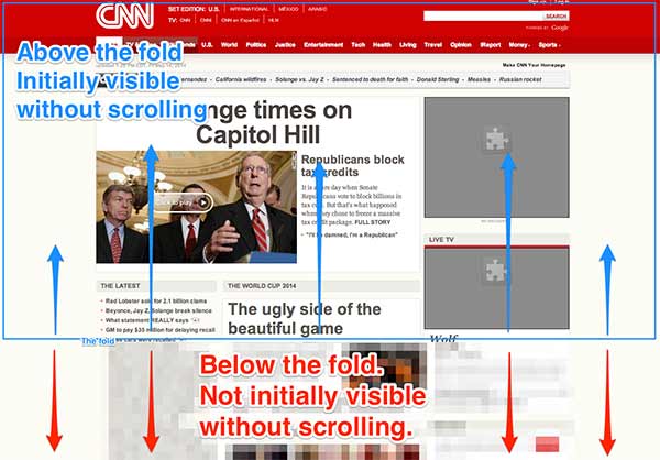
Stop Worrying About "Above the Fold"


"Above the fold" is a really common concept I've encountered when working with clients.
If you're not familiar, it's the idea that you should put calls to action, important stuff, or just as much stuff as possible so that it shows up on a typical computer screen without scrolling.
The idea came from newspapers that actually had a fold. In the newspaper world, "above the fold" is whatever headlines, images, content, etc that are shown on the front page when the newspaper is folded in half like it usually is on a newsstand.
The idea makes sense from the perspective of a newspaper, but only in a single context: People walking by a newsstand are going to be more likely to notice the paper and buy it if there is some interesting or unique content that they can see right away.
In other words, the purpose of the content above the fold in a newspaper is to catch someone's eye and, perhaps most importantly, buy the paper and read what's inside. It's to encourage people to take the next step; in the case of a newspaper, to open it.
The problem is that this concept has been taken to the web without consideration of it's origin or original purpose.

I've heard any number of these variations on "above the fold" when applied to websites:
The problem with all these is that they completely ignore one key aspect behind the concept of "the fold": That the only purpose of above the fold content is to get people to take the next step.
Let's say you're a software provider and you want people to download a free trial. Putting a free trial call to action above the fold is putting the cart before the horse. You haven't even explained who you are or what you do and you're already asking people to sign up for a free trial. Unless most of the visitors to this page are already well-versed on your product and ready to try it, this just doesn't make sense.
Instead you need to get people to take the next step. In the case of a software provider, that might mean a big headline that describes the major benefit of your product, some copy about who your target market is (so your prospects can self-qualify) and more information describing features, benefits, case studies, testimonials, social proof, etc.
Check out this Kissmetrics post for some great examples of this concept.
This is just plain silly. So silly I thought of not including it here but I've actually seen cases where people tried to cram as much as possible "above the fold." This just won't perform well under any circumstance. People need whitespace – looking at something without it is uncomfortable and people will leave your website in droves.
This isn't a terrible offense, as long as you understand what the important content is on a given page. The important content is not the paragraph that tries to close a sale. The important content is whatever lets people know they're in the right place and encourages them to keep going.
For most homepages, that's going to be a brief, punchy headline that describes who you are and what you do and some info to help prospects self-qualify. Finally, a little encouragement to keep reading.
So, next time you hear someone say "above the fold," remember the only purpose of "the fold" is to keep people reading, watching, listening, etc.
And, just in case you're completely sold on the idea of the fold and think I'm a raving lunatic, here are some stats:
And some awesome resources for more info: